Savicore (now sabu.gg) · Jun 2024 – May 2026 · 0-to-1, shipped
Product Platform
Keeping a fast-growing coaching product coherent, from the first dashboard to a shared app shell.
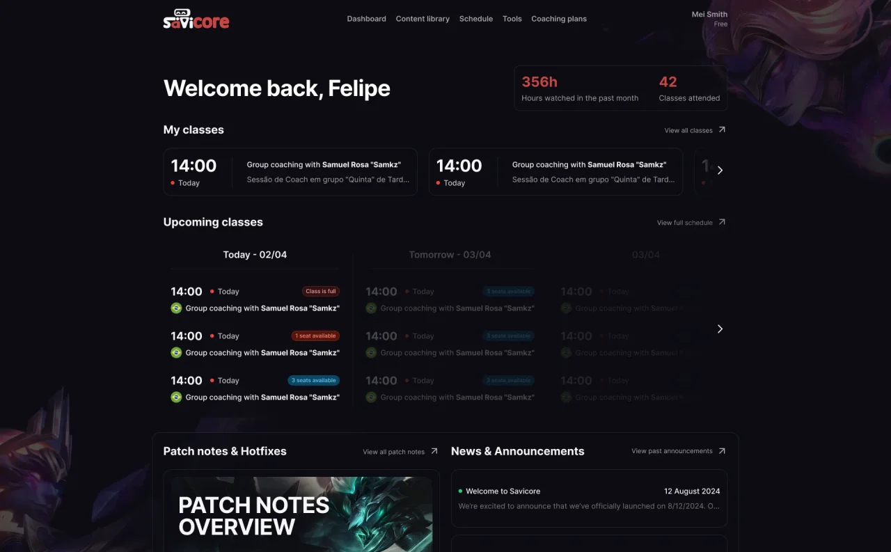
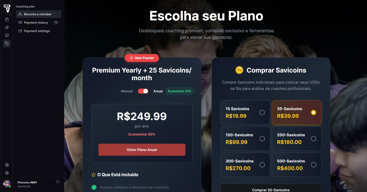
Savicore, now sabu.gg following a $1M funding round, teaches League of Legends through live classes, a video library, and coaching. As the company's sole designer for two years, I designed most of what logged-in students see: dashboard, content library, players, schedule, articles, and plans.
This case study focuses on the decision that kept those features one product: moving everything into a shared navigation shell.
01 / Context
Every feature arrived on its own schedule.
A small team built the product one feature at a time: dashboard, content library, video and live-class players, schedule, articles, plans, then coaching and tournaments.
Each page worked well on its own, but the top navigation holding them was running out of room. The risk was a product that felt like a collection of separate projects. My through-line was keeping it coherent without slowing delivery.
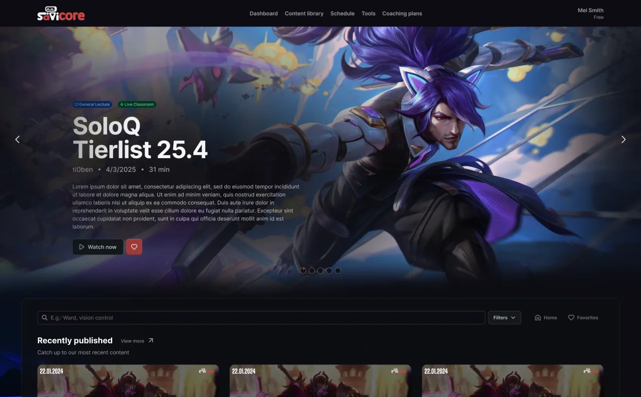
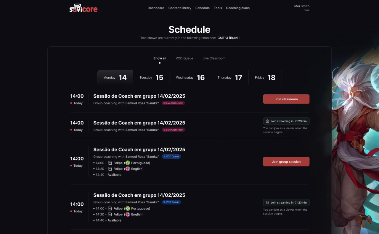
I grounded the core pages in conversations with students. Interviews in early 2025 showed that the class schedule was where students got the most value, and that they often forgot booked classes. So the dashboard leads with each student's classes and upcoming sessions.
02 / The result
The surfaces students use every day.
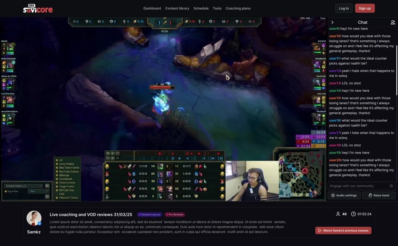
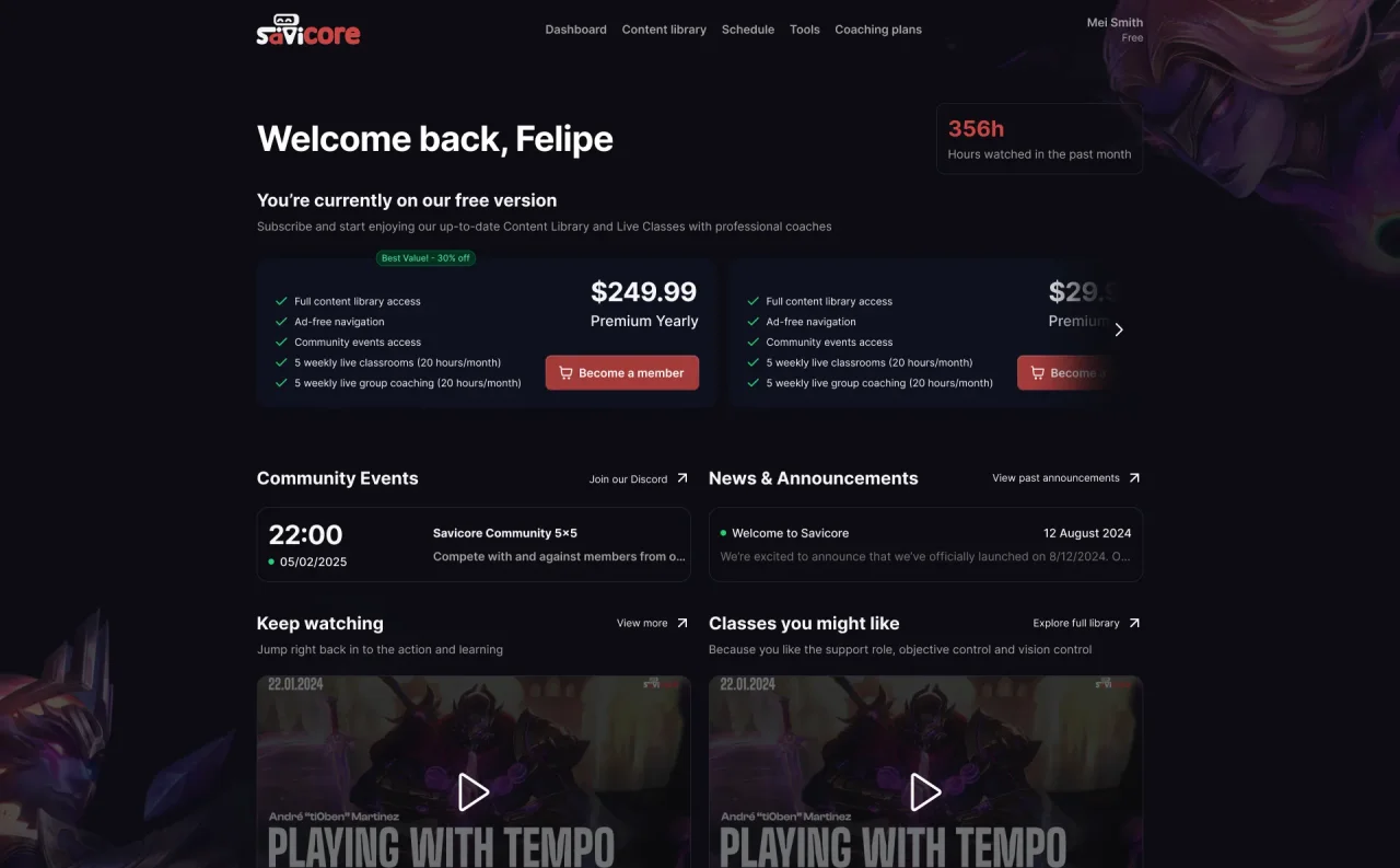
Core logged-in experiences I designed and handed off, each with desktop, tablet, and mobile versions.
03 / Decision · Navigation
Moving the whole product into a sidebar.
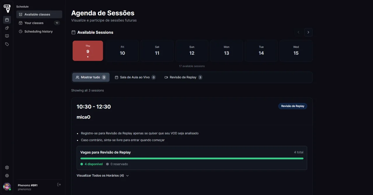
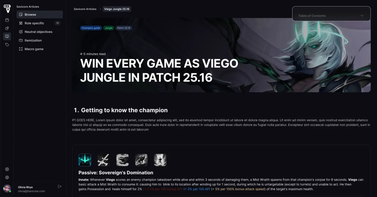
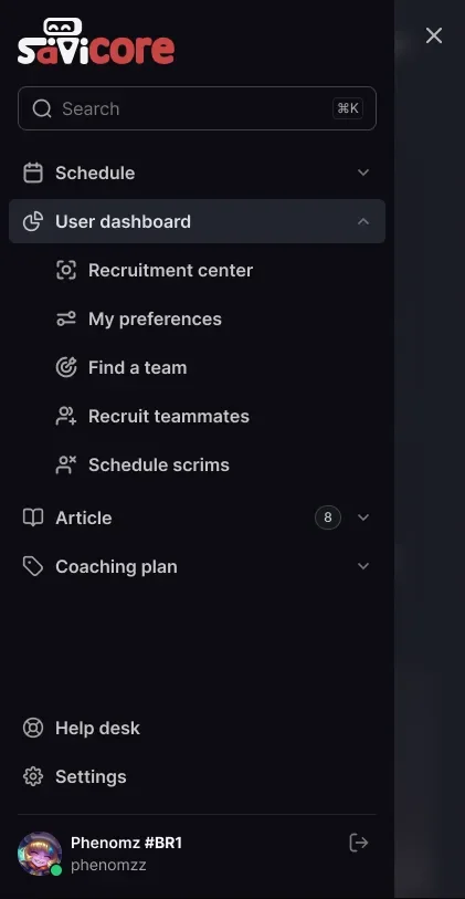
With articles, coaching, tournaments, and partner pages on the way, the top bar would either overflow or hide things in menus. I moved navigation into a sidebar with grouped sections, a collapsed icon rail for focused pages, and a drawer on mobile.
I tested it first with only existing pages. That review showed the top icons weren't self-explanatory, so I relabelled and regrouped them before any code was written.
04 / Decision · Transition
Designing for two navigations at once.
Features couldn't pause for the migration, and nobody knew whether they would ship before or after the sidebar. I built pages with auto layout so their content was independent of the navigation, and handed off each one in both versions. The sidebar itself became a design system component, so adding a destination was a single change.
05 / Impact
What the system made possible.
One foundation.
Coaching, articles, partner pages, and tournaments reused the same shell and components.
Features shipped when ready.
Because pages were handed off for both navigations, none needed a redesign when the sidebar went live.
06 / Reflection
Layout rules belong in the system from day one.
Components carried over to code consistently, but grid and scaling rules lived only in the design files, and some pages didn't fit common screens once built. I documented margins and breakpoints later. I now set them alongside the first components, together with a check on who owns each image a design depends on.
Next case study
Tournament Platform All work