DesignCircuit UX course · Independent concept
Insurance app concept
Making insurance easier to manage for AXL, a fictional insurer.
A multi-service insurance app concept connecting quotes, policy changes, claims, and support. The research shifted the focus from consolidating services to making their value, costs, and routes to help understandable.
01 / The brief
One app, across very different moments.
The DesignCircuit UX course proposed a simulated engagement with AXL, a fictional insurer. In the brief, its services were spread across more than eight apps. The challenge was to bring them into one experience that offered value both in everyday use and when someone needed urgent help.
Seven journeys framed the scope: onboarding, free or paid sign-up, exploring products, purchasing, managing services, activating claims, and accessing benefits. Discovery needed to clarify what guests could do, how customers would understand their coverage, and how recurring costs and changes should be presented.
I carried the work from research and synthesis through information architecture, flows, paper and digital wireframes, and a mid-fidelity pilot. The project was a course exercise; the real insurers reviewed during research, including AXA, were research subjects rather than clients.
02 / Research
An app needs a reason to be used.
Desk research explored digital insurance, Open Insurance, and the relationship between customer expectations and established service models. Competitor reviews and walkthroughs of AXA, Admiral, Aviva, Lemonade, Youse, and Barclays exposed recurring questions about access to support, claim progress, coverage, and unexpected charges. Public reviews helped frame these questions; they were directional accounts, with some crops missing the insurer’s name.
A bilingual survey collected 13 responses: nine in Portuguese and four in English. Eight respondents had insurance; four of those eight used their insurer’s app. Three of the four app users said they found what they needed easily. Price and inflexible coverage or pricing appeared as purchase barriers, while one account described an app that offered too little value compared with the website.
Two interviews added context to the survey. Paying repeatedly without a visible return made insurance difficult to value; an app that only collected information available elsewhere offered little reason to return. These were small, exploratory studies recruited largely through my network. The survey had no age filter, and some question wording limited the insights. I used the findings to guide design questions, not to represent the wider market.
03 / Priorities
Digital speed still needs a human fallback.
I moderated five tasks on Youse with four participants. All four initially looked for FAQs in the footer; three needed help finding them, and none found the benefits club unaided. Everyone used the floating contact control. Together with the interviews and survey, these observations shaped four priorities. Two sessions lost their audio recordings, so their observations rely on facilitation notes.
Let people explore before committing.
I proposed a useful experience for non-customers and moved phone and email collection later in the quote flow. People should be able to understand an offer before being asked to establish a relationship.
Make the route to help recognizable.
A help label did not reliably signal where FAQs lived. Human contact and self-service guidance needed clear names and visible entry points, especially around claims and moments of uncertainty.
Connect coverage to cost.
Price concerns and requests for flexibility made policy changes a central task. The design needed to explain what was covered, what could change, and what a change would cost before confirmation.
Preserve a sense of progress.
Participants worried about losing completed information, and a device-specific back-navigation problem reset a competitor flow. Clear steps and ways to revisit answers became design priorities. Their implementation would still need checking in a functioning product.
04 / Structure
Turning research into a usable structure.
I grouped the research into how-might-we questions and revised the job stories around the tension between faster digital service and effective human contact. A MoSCoW exercise sorted 49 ideas into 17 must-haves, 13 should-haves, 14 could-haves, and five items outside the intended scope. Late data capture, centralized policy management, claim visibility, and human contact were among the priorities.
A heuristic review of AXA’s digital service identified nine issues across seven heuristics, including unhelpful FAQ results, inconsistent calls to action, and a hard-to-find travel quote path. I proposed 11 improvements and used the review to sharpen requirements for the concept. These were observations of the service at the time of the project.
A closed card sort involved nine people, five insured and four uninsured. The documented feedback exposed insurance jargon and missing contact and payment-document entries. It helped refine the structure, but the analysis remained partial; I could not treat the whole navigation model as validated.
05 / Exploration
Making the important moments tangible.
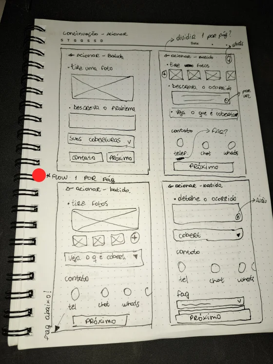
A Crazy 8s exercise with six participants explored ways into the app and its services. A content-led home and lower-cost plan alternatives during cancellation were among the directions carried forward. Hand-drawn flows and wireframes then made the quote, policy-management, claim, and support journeys concrete before I moved into low- and mid-fidelity screens.
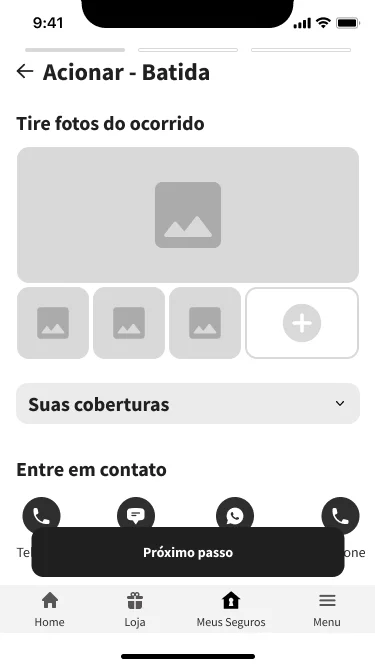
The claim sketches explored how photos, an incident description, coverage information, and contact options could fit into a sequence. Breaking that work into steps made it easier to reason about what someone would need at each point. The digital prototype developed that structure further.
The concept also included a store and benefits area to make value visible outside a claim. Its place in an insurance app remained a question to test, rather than an established reason for engagement.
06 / Getting a quote
Understand the offer before signing up.
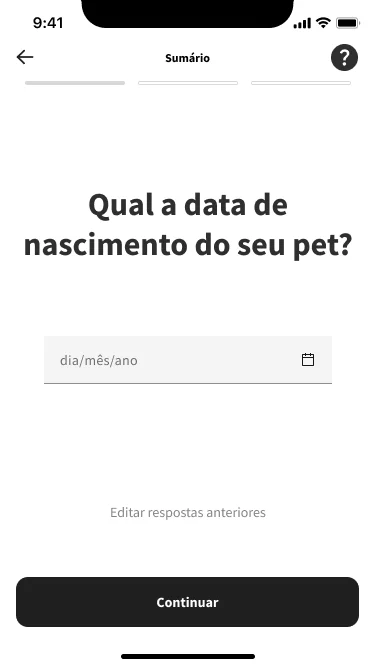
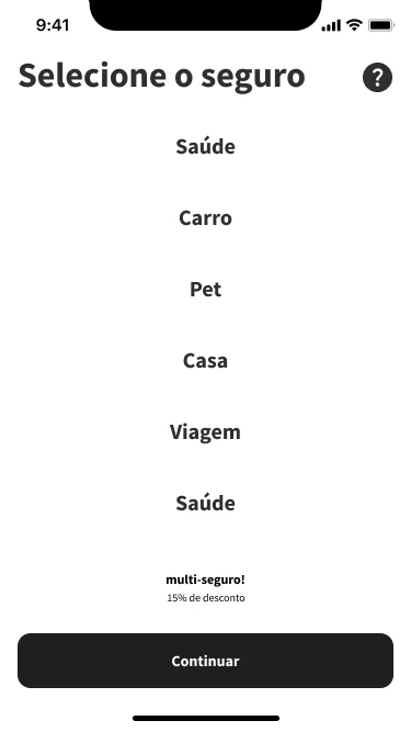
The prototype offered a quote without logging in, then let people select insurance types and work through focused questions. A pet-insurance branch explored a conversational sequence, with progress, help, and a way to revisit earlier answers. Plan presentation and purchase flows followed the quote.
The screens explored a multi-policy discount and example prices as part of the concept. These were illustrative product assumptions, not a commercial offer or evidence of an approved pricing model. The pilot’s positive response to the guest quote gave this direction an early signal of usefulness.
07 / Managing cover
Keep control and help close together.
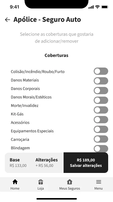
Policy self-service brought coverage changes and their proposed cost into the same view. The cancellation flow asked for a reason and explored cheaper alternatives before confirmation. The design intent was to offer a relevant option while retaining a clear route to cancel.
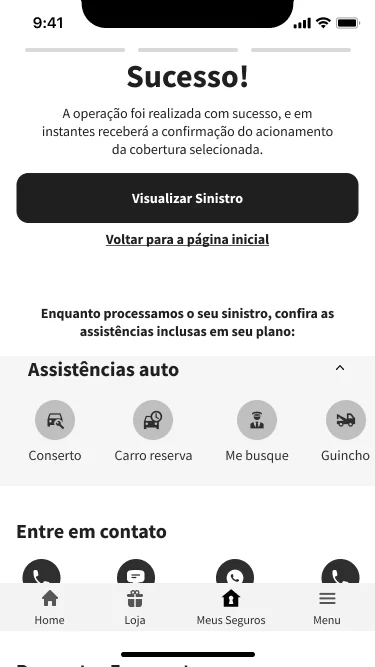
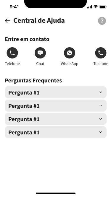
The claim flow moved through photos, a description, follow-up questions, and confirmation, with links to claim status and assistance such as towing or a replacement car. The help hub grouped FAQs with phone, chat, and WhatsApp. Including a channel in a screen was only a starting point: the pilot still showed that contact options and claim entry needed to be easier to notice.
These screens show the original mid-fidelity work. Content and interaction details still needed refinement before a higher-fidelity iteration.
08 / Pilot testing
A useful direction, with friction still visible.
A moderated pilot with two participants, one insured and one uninsured, explored five tasks: quote, product presentation, purchase, claim, and cancellation. I used their qualitative feedback to identify changes for the next iteration. The pilot did not establish completion-time improvements, a task-success rate, or a validated end-to-end experience.
Keep the guest quote.
The ability to get a quote without logging in was received positively. It supported the decision to let people explore value before asking them to sign up.
Give claims a clearer entry point.
A participant struggled to find where to start a claim and suggested a more prominent primary action. The next iteration needed to make that task easier to recognize from the home screen.
Explain the store and expose support.
The store felt unexpected until onboarding explained it, and a participant missed WhatsApp. These observations called for clearer framing and more discoverable contact options.
Make alternatives relevant to the reason for leaving.
A participant who found the offer expensive responded positively to cheaper plan alternatives. That was a useful observation about relevance, not evidence of improved retention.
09 / Outcome
A foundation for the next iteration.
The result was a research-informed structure, a set of core flows, and a mid-fidelity insurance-app prototype reviewed in an early pilot. The work connected concerns about value, flexibility, and support to specific interface decisions: guest quotes, visible policy changes, a staged claim flow, and multiple routes to help.
The next step is to refine claim entry, clarify the store’s purpose, and make contact options more visible, then retest those journeys with a broader sample. I would also finish the journey mapping and card-sort analysis, replace placeholder content, and complete the pilot’s structured analysis before taking the strongest flows to high fidelity.
The project remained a course concept. It was not launched, and the available work does not establish business impact or demonstrate that the pilot findings were implemented and retested.
10 / Reflection
Convenience has to feel dependable.
Bringing services into one app was the starting point. The more useful design question was whether someone could understand their options, see the effect of a decision, and reach help when self-service stopped being enough. That became the thread connecting the work.
Next case study
Self-checkout concept All work