UX course project · Independent concept
Self-checkout concept
Exploring self-service shopping with Square Register.
Created for coursework; not commissioned by or affiliated with Square. The app and smart-cart concept connects product discovery, shopping lists, assistance, and checkout to give shoppers more control over the supermarket trip.
01 / The challenge
Self-service has to work beyond checkout.
The academic brief explored how Square Register could support self-service shopping, from choosing and scanning products to paying. It introduced proto-personas and possible journeys involving identification, weighed products, item removal, and help. I treated these teacher-provided materials as starting assumptions to investigate.
As the research developed, a broader question emerged: how might shoppers find what they need, understand their basket, and recover when something goes wrong, while moving at their own pace?
This was an academic exploration, not a commission for Square or a shipped product. My contribution covered research, problem definition, service mapping, information architecture, concept development, prototyping, and usability testing.
02 / Research
Grounding the concept in the store.
Desk research compared conventional self-checkout, scan-and-go, smart carts, and checkout-free stores, including Square, Amazon, Veeve, Trollee, and Caper. Vendor material and public reviews helped frame questions about registration, recognition, payments, accessibility, and staff intervention. They were external research inputs, separate from my participant evidence.
Fieldwork at Zaitt and Hiper Moreira made those tradeoffs concrete. Zaitt showed the convenience of scan-and-go and a live basket alongside the effort of registration and digital access. At Hiper Moreira, weighed-product selection, scanning exceptions, cancellations, and staff-dependent recovery exposed interruptions to independent shopping.
Exploratory conversations, an initial eight-response survey, a later 21-response survey synthesis, and three structured interviews explored product finding, help, app adoption, and exceptions. These were separate activities, not one combined participant sample. I also revisited the initial desk research when it proved too shallow to support the direction.
03 / What mattered
Four findings shaped the direction.
The recurring theme in the synthesis was control: understanding what is happening and knowing what to do next.
Finding a product is part of the purchase.
In the later survey synthesis, 20 of 21 respondents had left an item unpurchased because they could not find it; 11 of 21 frequently struggled to locate products. This made discovery and navigation relevant to the concept. These self-reports do not measure lost revenue or predict the effect of a new feature.
Autonomy needs a route to recovery.
Scanning, weighing, cancellation, and payment problems could bring an independent trip to a stop. Help needed to be visible at the moment of need, with clear feedback while waiting for assistance.
The system must explain its capabilities.
Unfamiliar hardware and weighed produce created uncertainty about what shoppers should do and what the system would do for them. Instructions had to connect the interface to the physical cart.
An app needs to earn the effort.
A download and registration add work before shopping begins. Lists, continuity between visits, useful benefits, and an easier in-store journey became possible reasons to adopt a companion app.
04 / Service & scope
Designing for the moments that break the flow.
Jobs to be done connected practical tasks, such as locating products and correcting the basket, with the desire to feel independent and avoid embarrassment. Service blueprints mapped the journey before, during, and after shopping, making staff, store systems, and hardware dependencies visible.
Affinity mapping and How Might We questions organized opportunities around entry, scanning, weighing, navigation, payment, human support, accessibility, and shopping lists. User flows and MoSCoW prioritization narrowed the concept, while leaving technology-dependent questions open.
Recovery became part of the proposed service. If an item was not recognized, a shopper could check the virtual basket, retry, or request help. Product finding could begin with search or catalogue browsing and continue through navigation or staff assistance. Weighing and payment flows exposed dependencies on scales, kiosks, employees, and supported payment methods.
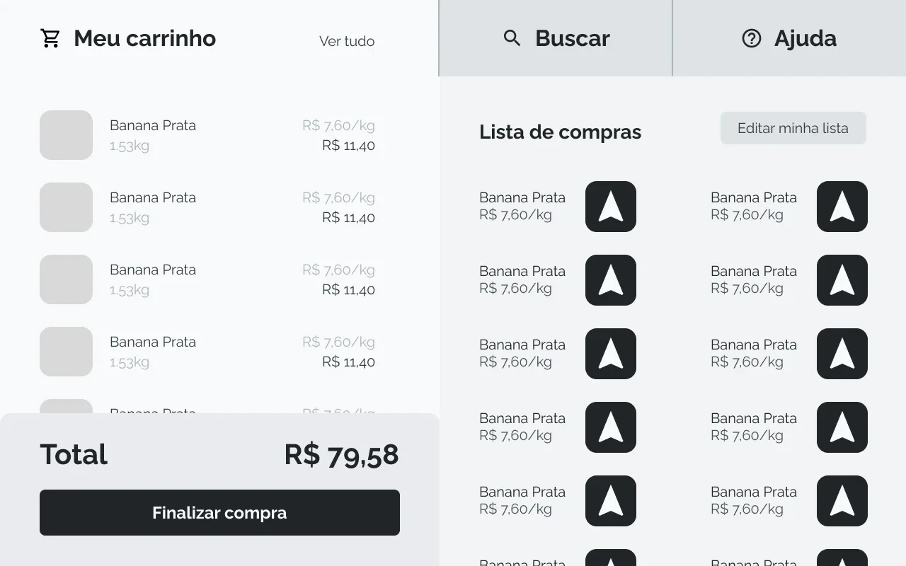
The direction became a companion app and a cart interface: prepare a list, discover and locate products, understand the current basket, get help, and finish payment.
05 / Testing the structure
Checking assumptions before adding fidelity.
Each activity answered a different question. Small samples and study setup issues limited what I could conclude.
Heuristic evaluation
Reviewing Hiper Moreira identified four actionable issues: an unclear product-search entry, difficulty recognizing weighed products, limited control over cancellation, and insufficient explanation while waiting for staff.
Early task test · 7 participants
Observations helped identify friction in the self-checkout journey. Misconfigured paths and task requirements made aggregate scores unreliable, so I did not treat this activity as a clean success-rate benchmark.
Closed card sort · 10 participants
Ambiguous cards and category language produced inconsistent groupings. Help had a clearer association with calling an attendant and finding FAQs. The exercise also exposed wording that needed improvement in the study itself.
Moderated tree test · 1 participant
This provided directional feedback on navigation and terminology. When the cart’s scale was not apparent, the participant expected staff involvement. A menu entry alone would not explain the physical interaction.
06 / Exploration
Making the journey tangible.
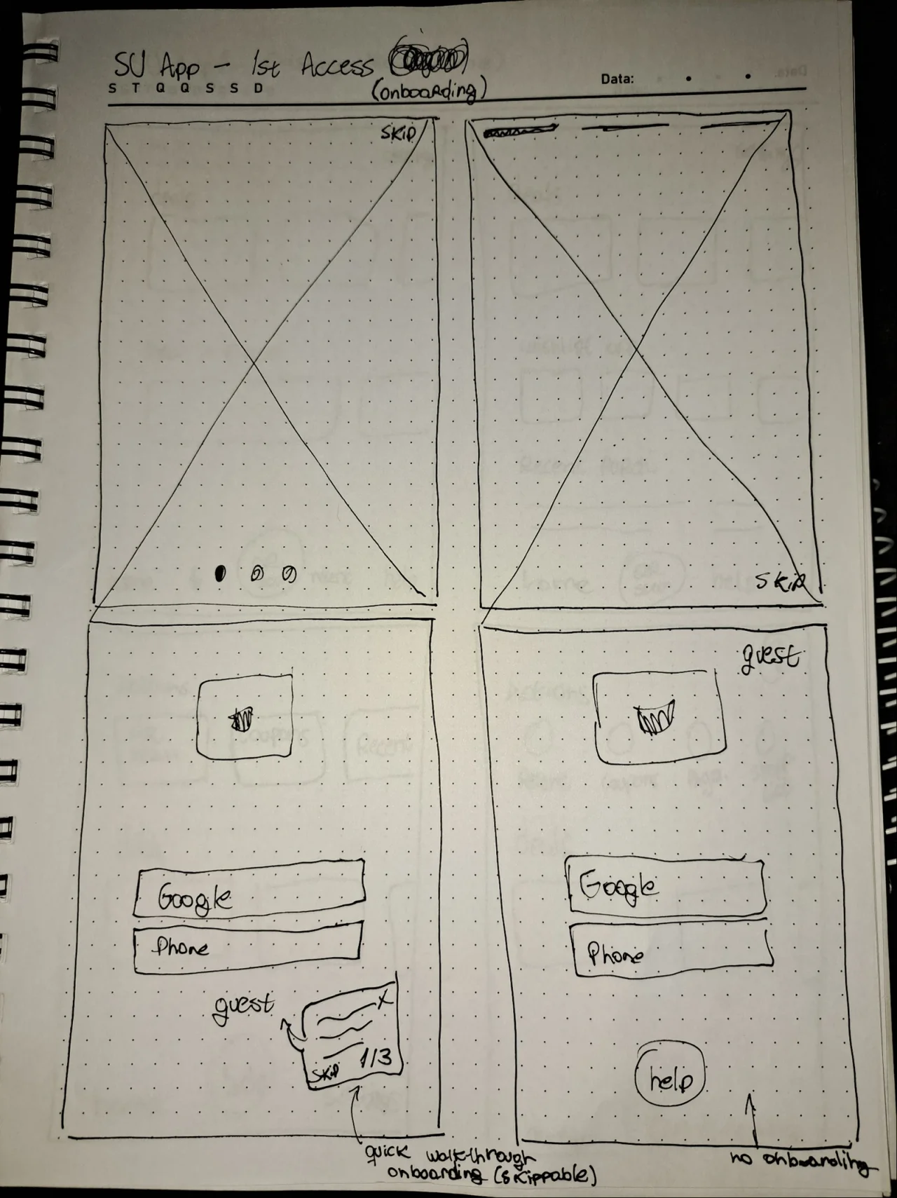
A remote Crazy 8s exercise and voting explored home, help, navigation, and payment directions. Two rounds of paper wireframes developed the app and cart structure before I produced digital mid-fidelity cart screens.
The paper explorations considered broader app functions, including profile and purchase history. The most developed digital outcome was the cart prototype; it did not represent a fully realized companion app.
07 / The prototype
From starting the trip to completing payment.
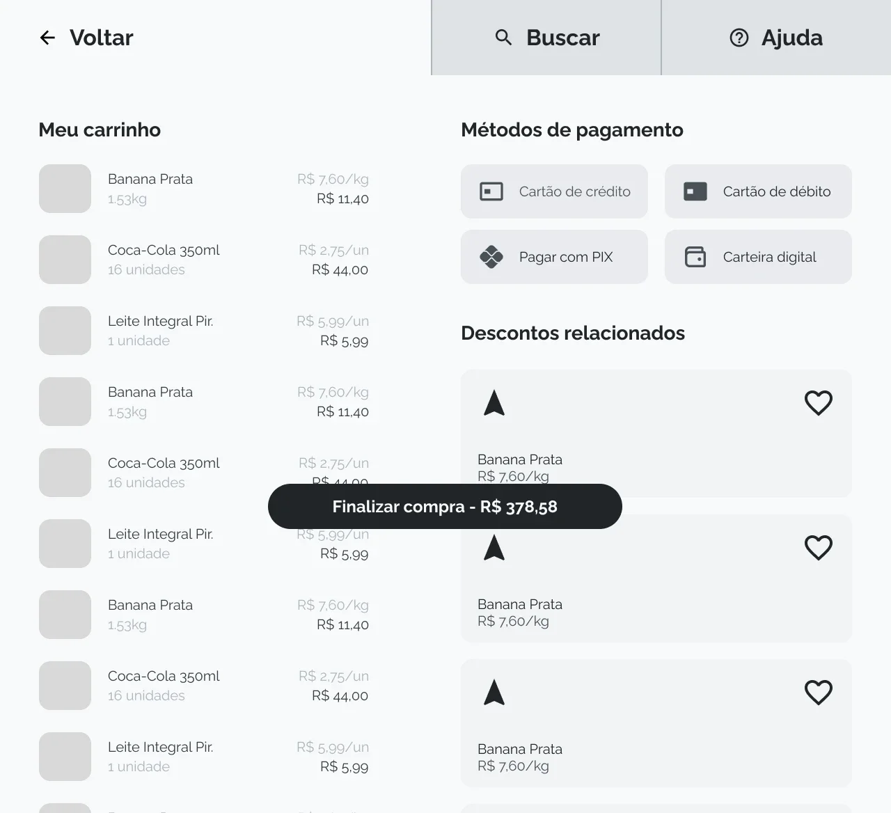
The cart prototype connects catalogue and search, product details, the shopping list, and a visible running total. Navigation and assistance remain accessible throughout the journey.
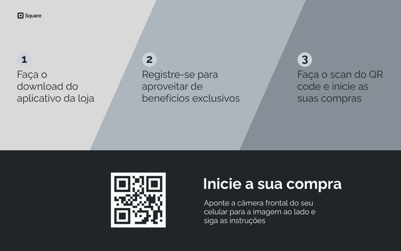
The digital entry screen retained app download, registration, and QR entry. Research had already exposed adoption friction, so the value and explanation of these steps remained an important question for testing. Payment screens extended the flow into parking, confirmation, and receipt options.
08 / Usability
What the prototype made clear, and what it didn’t.
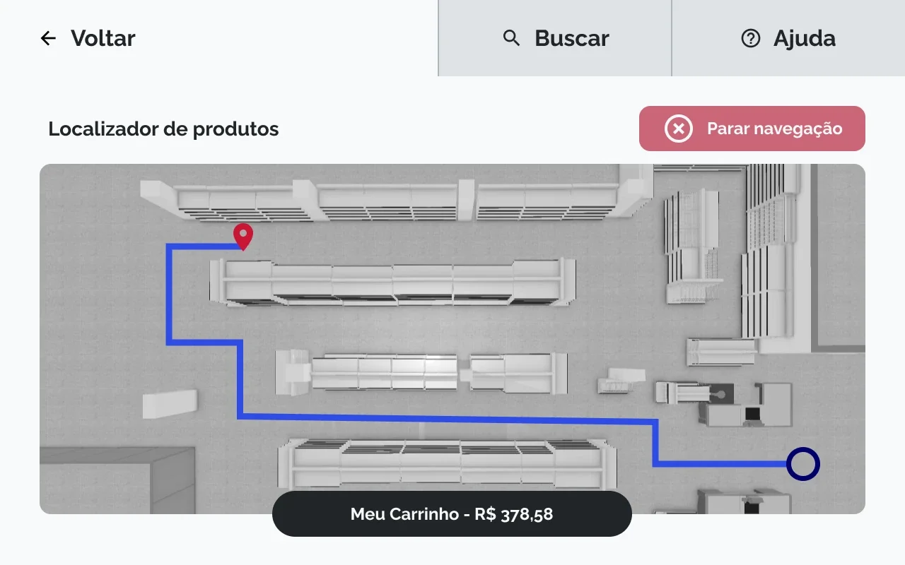
I tested the Figma wireframes remotely with two participants across first contact, list editing, search, navigation, help, and payment. One participant described navigation as useful after a familiar store rearranged its shelves. That supported the feature’s perceived relevance; it did not establish a measured time saving.
The sessions defined these priorities for the next iteration. The evidence does not establish that every refinement was implemented and retested.
Explain the cart at first contact.
Onboarding needs to make the cart’s capabilities understandable, including what shoppers cannot infer from the hardware.
Make list actions discoverable.
Editing, swipe gestures, and the heart/favorite action needed clearer meanings and a more obvious relationship to the shopping list.
Improve search and map hierarchy.
Search needed clearer filtering and relevant results. Navigation needed more legible current location, destination, product labels, and map symbols, with less clutter.
Use familiar shopping language.
Help should distinguish self-service guidance from calling an attendant. Checkout labels should clarify the relationship between the purchase, parking, discounts, CPF identification, and receipts.
09 / Outcome & next steps
A tested foundation, with real questions still open.
The outcome was a research-informed app-and-cart concept and a mid-fidelity cart prototype with specific usability priorities. The work connected shopper research to service decisions and interface choices, while making unresolved dependencies visible.
The project remained at concept and prototype stage. It did not establish live-store improvements in queue time, sales, staffing, or error rates. Visual and microinteraction references informed exploration; they were not evidence of a polished, shipped product.
Next, I would apply the findings and retest complete shopping tasks with a broader sample. Accessibility remained underexplored and would need research with people with different vision, hearing, and mobility needs. Recognition, weighing, payment integration, and staff handoffs also need evaluation with the physical cart in a store.
10 / Reflection
Independence depends on understanding.
My main learning was that a self-service experience earns independence by making its state, next actions, and routes to help understandable. That principle connected the whole shopping trip.
Next case study
Product Platform All work