Savicore (now sabu.gg) · Oct – Dec 2025 · Shipped
Coach Booking
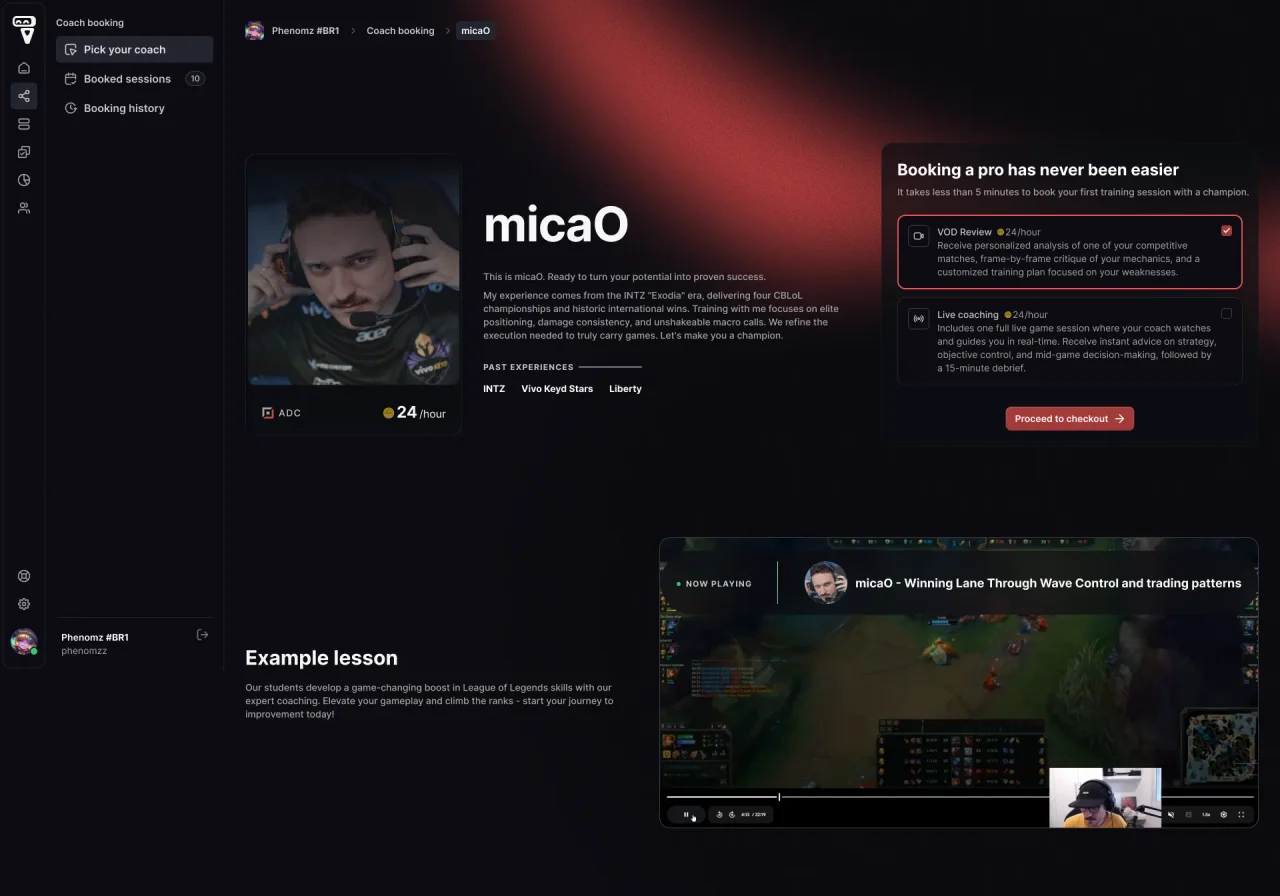
Turning 1-on-1 coaching from private messages into a product: find a coach, book a session, and review it afterwards.
Savicore (now sabu.gg) teaches League of Legends through live group classes. Students who wanted individual coaching had to message a coach directly and arrange availability, price, and payment themselves.
I designed the booking experience that replaced this, from discovering a coach to reviewing the session afterwards. It launched in December 2025.
01 / Context
Individual coaching happened outside the product.
Arranging a session by private message worked for confident students. Everyone else never reached out, and the platform had no part in the booking, the payment, or the follow-up.
Earlier research I had done on 1-on-1 coaching (competitor analysis of Metafy, Coachify, and Preply, plus student feedback) pointed to two barriers: doubt about a coach's quality, and the perceived risk of paying for a session that might not help. The design answers both.
My goal was to make booking a paid session feel as low-risk as joining a free class, and to give students a reason to come back afterwards. Pricing rules developed in parallel: Savicoins and US dollars, localized for Brazil and other regions.
02 / The result
Discover, book, review.
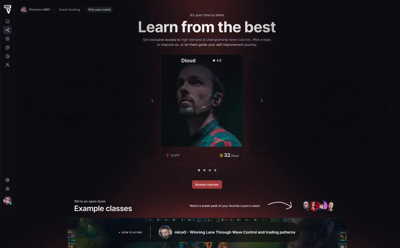
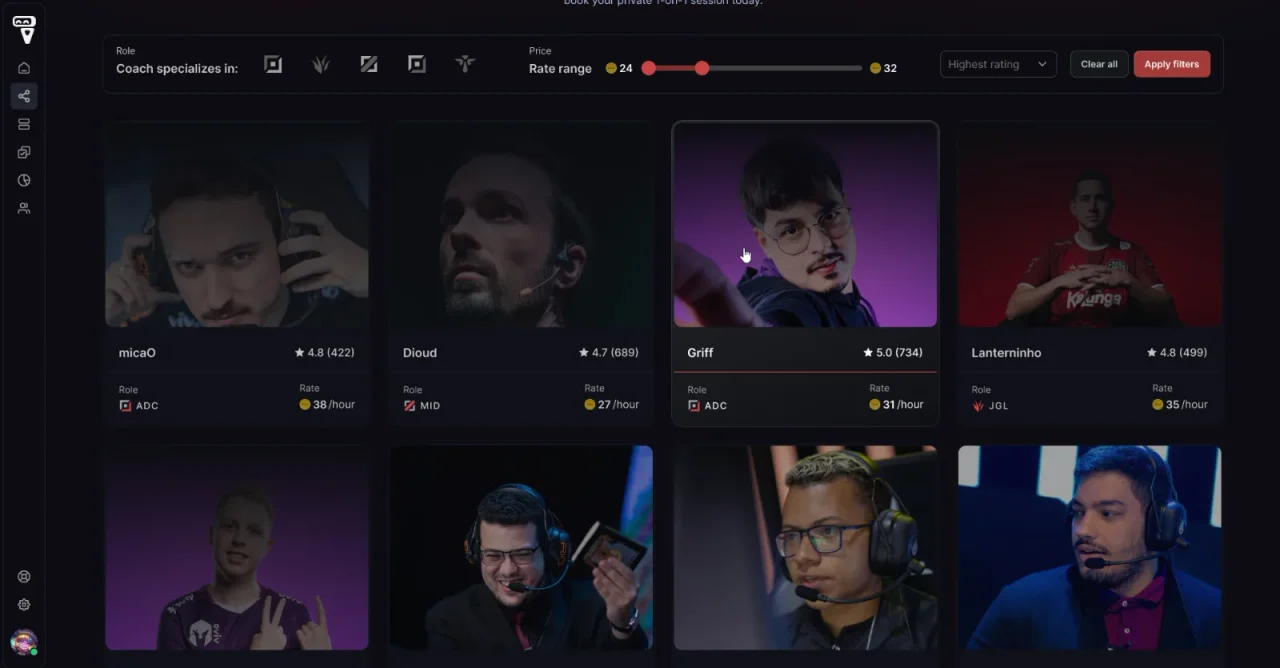
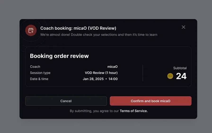
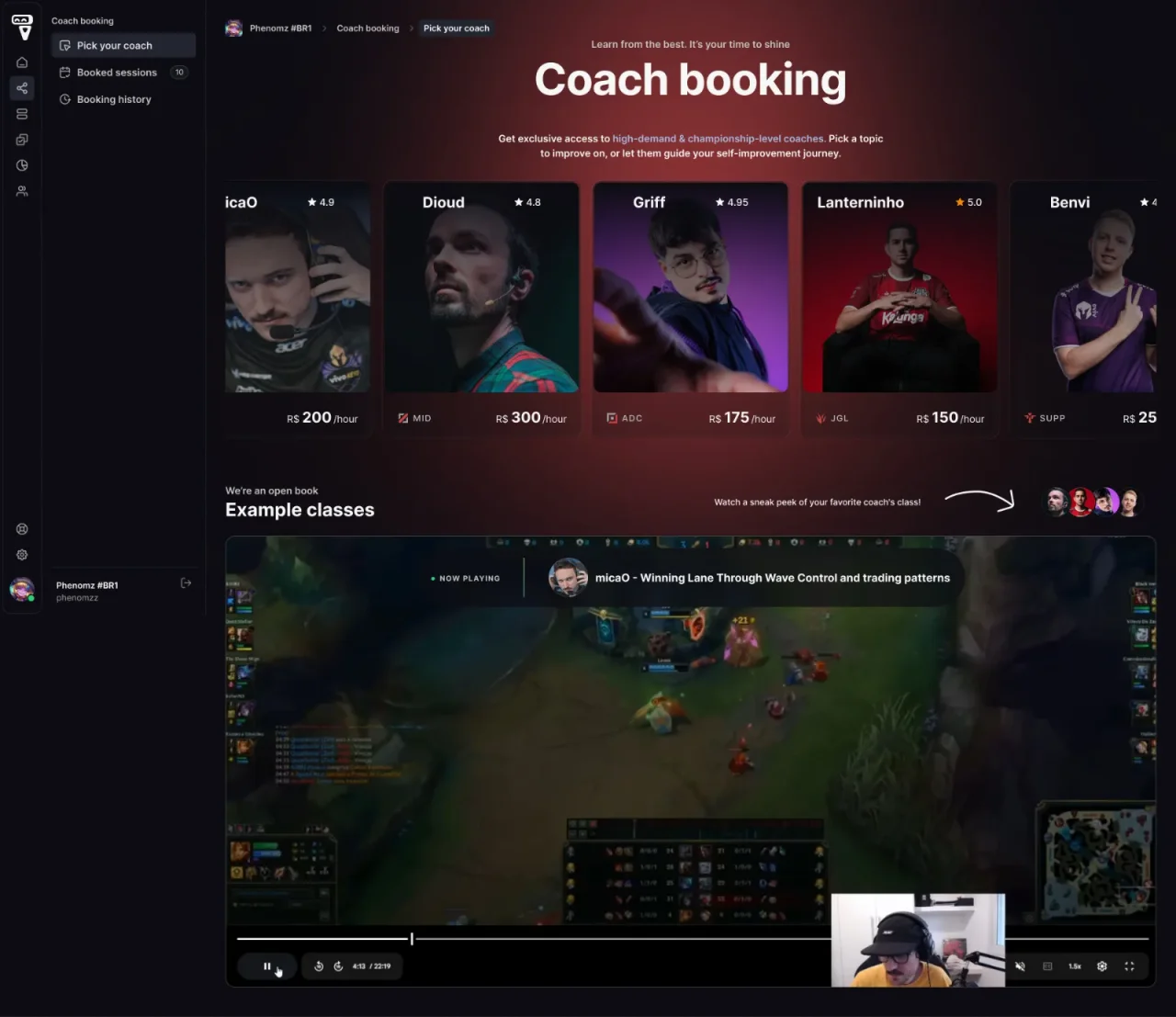
A browse page introduces coaches one at a time, with a full catalogue below. Coach pages set out session types, price, an example lesson, and reviews. A two-step modal handles booking.
03 / Decision · Browsing
A showcase first, then a catalogue.
My first direction showed every coach at the same size. It gave an overview of the roster but no clear place to start.
I split the page into two jobs. The hero presents one coach at a time, so each person gets real attention. A filterable catalogue below serves students who want to compare.
04 / Decision · The loop
Designing around the payment, not just up to it.
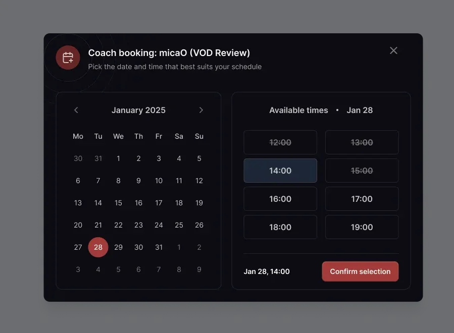
For booking, I used the model people know from Calendly and ADPList: the coach publishes availability, and the student picks a date and time in one view.
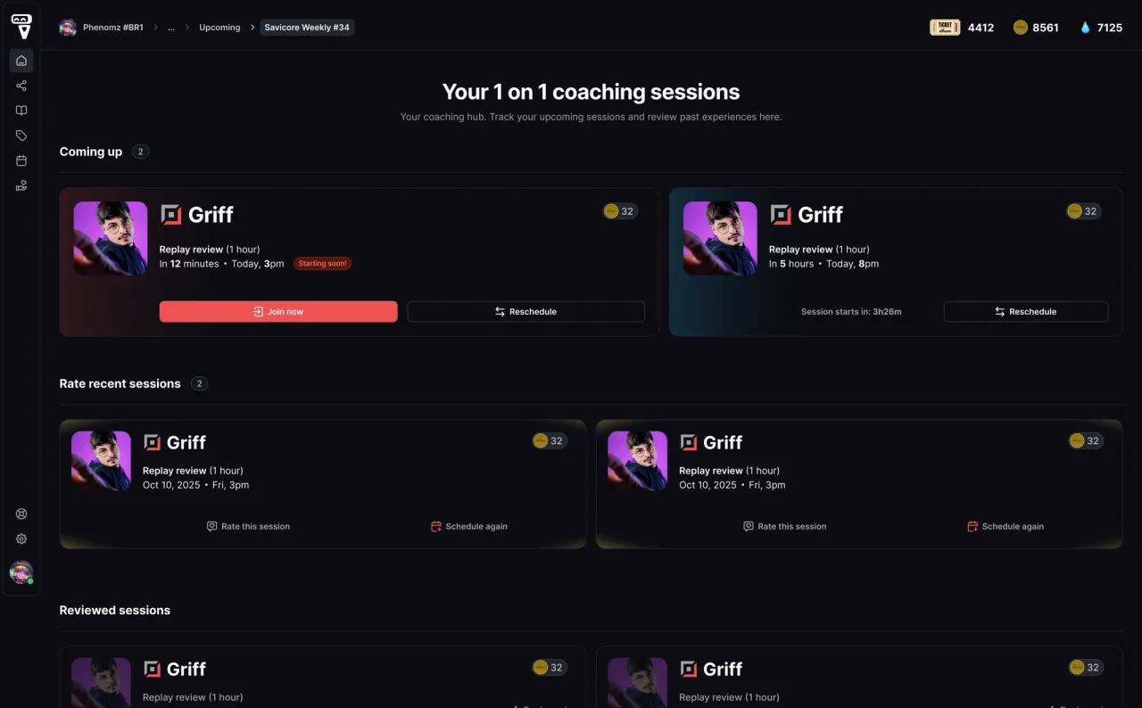
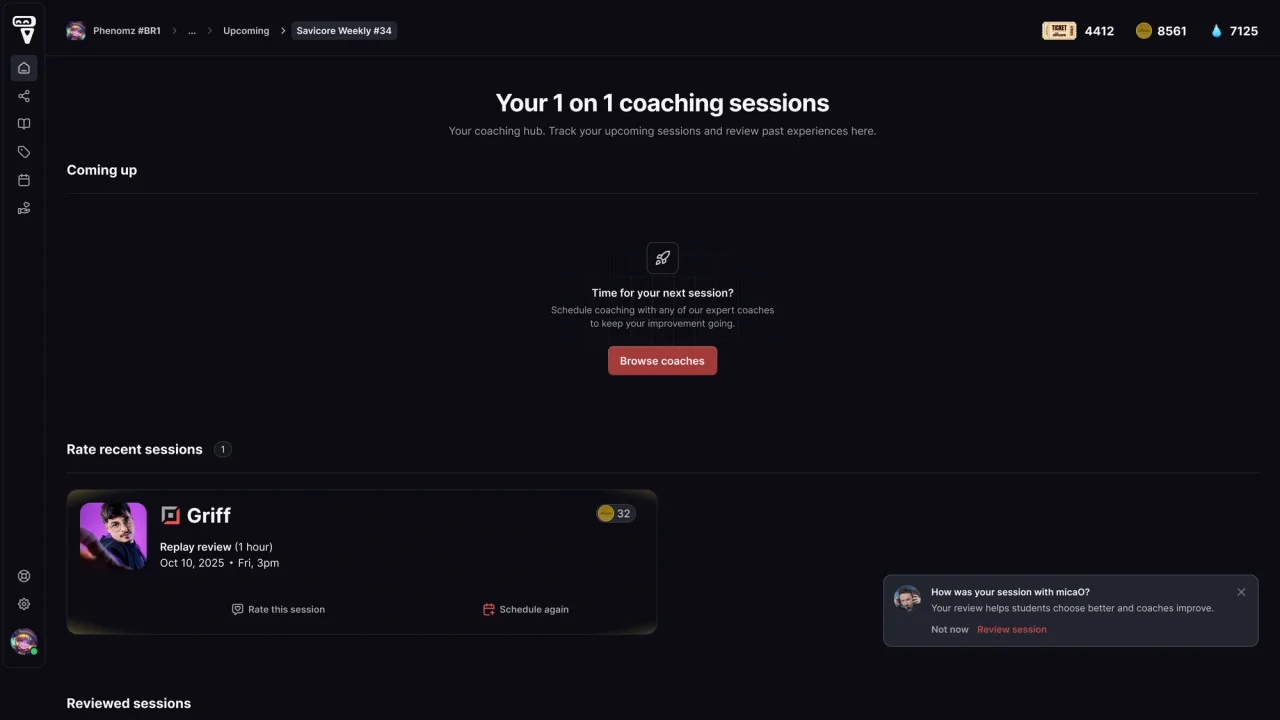
A booking doesn't end at payment. I designed a session history around what comes next: upcoming sessions, sessions ready for review, and rebooking. Each state gives the student a relevant action, and a prompt right after each session invites the review while it's fresh.
05 / Decision · Reviews
Short by default, deeper by choice.
Students want quick, honest signals; coaches want specific feedback. Asking for everything at once costs completed reviews.
One required step.
A rating and a short comment are enough to post. Ratings by category and tags are optional, and can be rewarded with Savisouls.
Detail where it helps.
Ratings below four stars invite a private note to the coach, where feedback is most actionable.
A clear way out.
I kept Cancel on every step, with a confirmation. A modal without an obvious exit feels coercive, and pressured reviews are less honest.
06 / Impact
What it made possible.
Conversion wasn't tracked during this period, so the impact shows in what the feature enabled.
Coaching inside the product.
Students could find, book, and pay for sessions without messaging anyone.
New coaches selling from day one.
Coaches outside the salaried team, including one in Europe, set their own prices and took bookings within weeks.
A feedback loop.
Reviews gave coaches structured feedback and students a reason to return.
07 / Reflection
Settle the business rules before the screens.
Pricing and currency changed while the UI was being refined. Each change was small, but together they created rework for design and engineering. I now align on rules like these in a short written spec before moving into high fidelity.
Next case study
Decks & Graphics All work