Savicore (now sabu.gg) · Nov 2024 – Dec 2025 · Visual design
Decks & Graphics
Editorial presentation and graphic design, made alongside product design at Savicore.
Alongside the product, I designed Savicore's presentation decks and social graphics: investor and partnership decks, templates for community tournaments, and two decks about the esports team Vivo Keyd Stars (VKS). I made the VKS decks as part of my work at Savicore, at the request of my manager there. I have never worked for VKS.
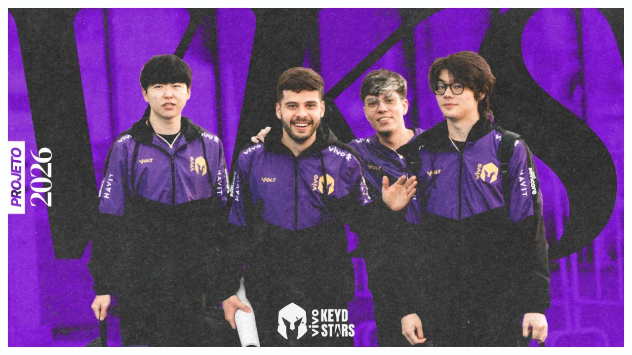
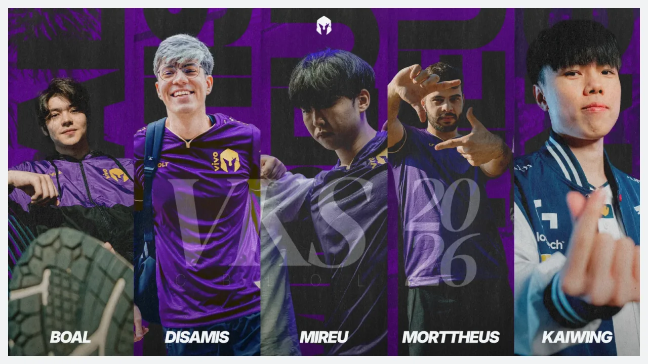
The highlight is the VKS 2026 season deck, an editorial recap of the team's five-year project.
01 / A note on the VKS work
Made at Savicore, not for VKS as an employer.
I have never worked for, or been employed by, Vivo Keyd Stars. Both VKS decks were made during my time at Savicore, at the request of Christopher "SeeEl" Lee, my manager at Savicore, who was also VKS's head coach.
Photography belongs to VKS and its photographers. My work was the layout, typography, image treatment, and compositing.
02 / Openers
Type as image.
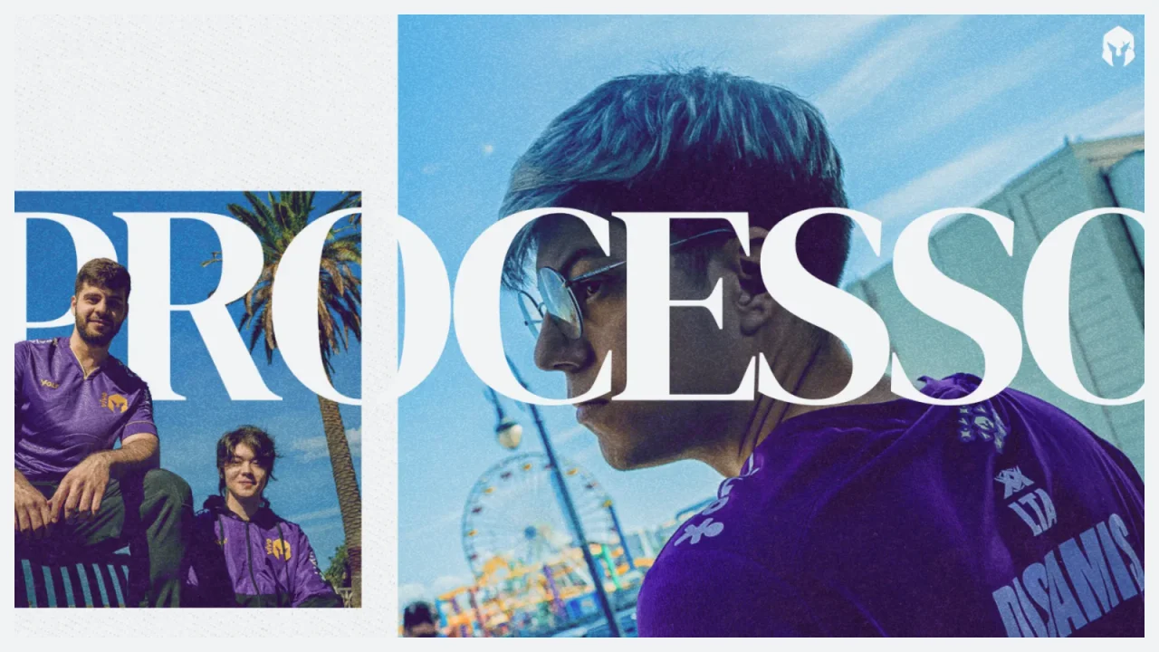
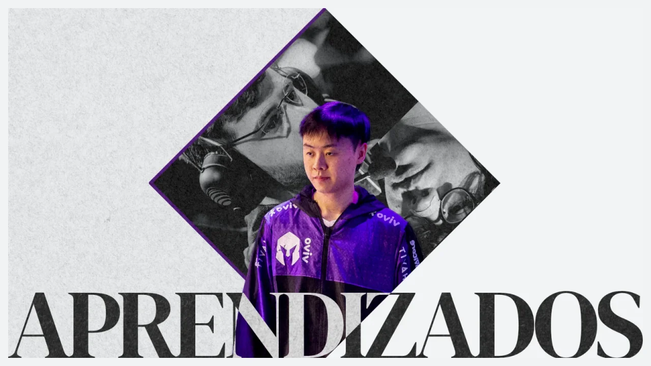
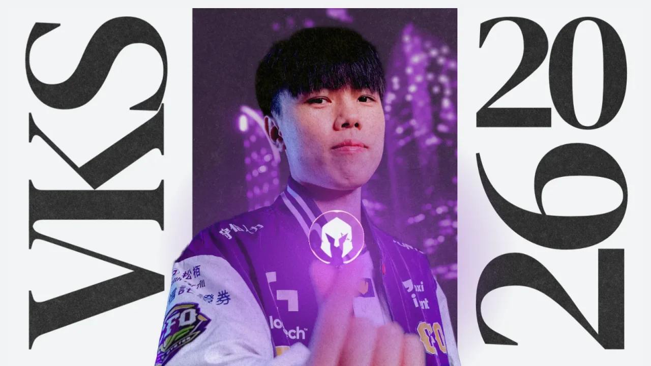
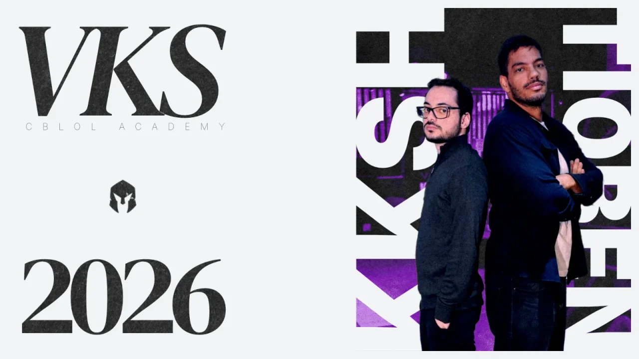
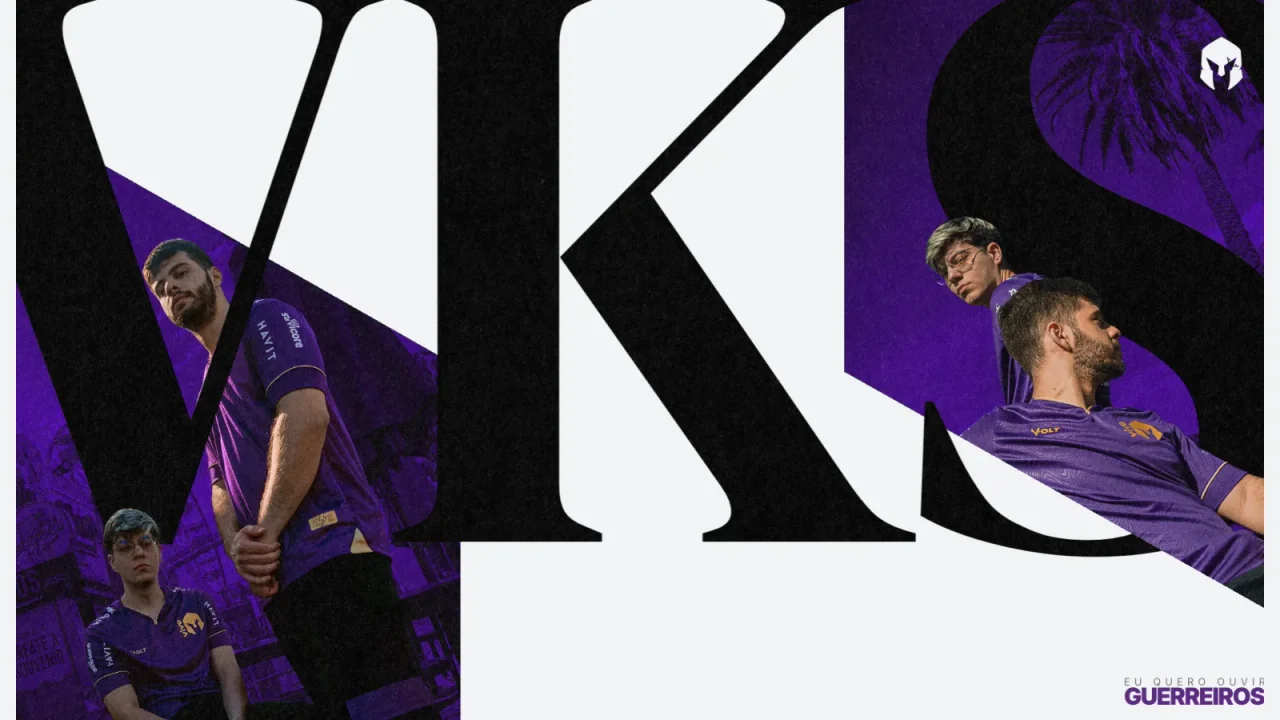
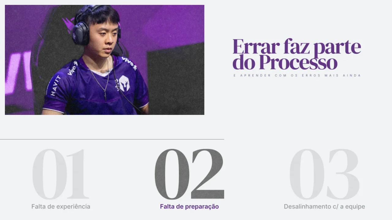
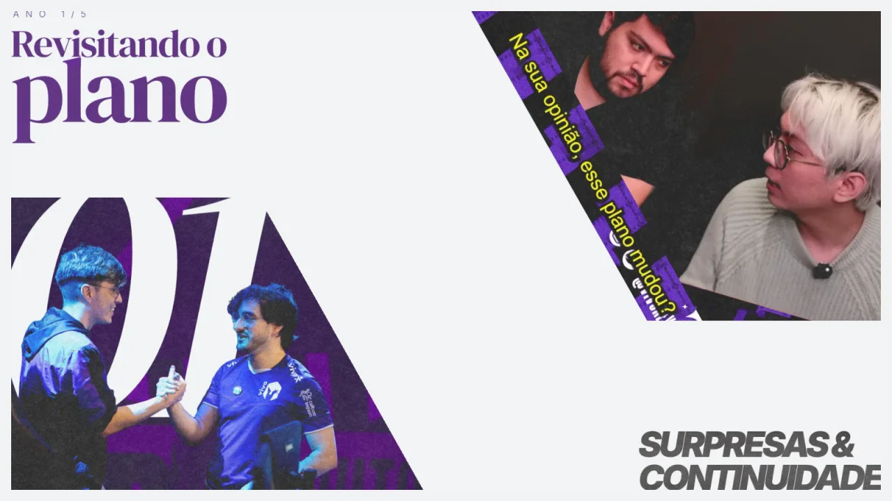
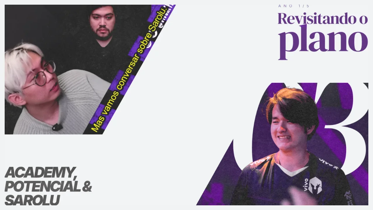
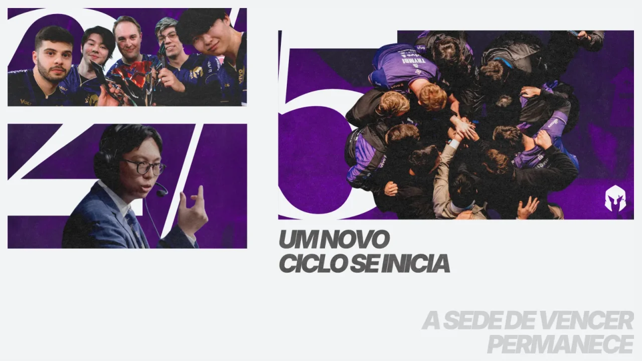
The 2026 deck recaps a five-year project and sets up the next season, so I designed it like a magazine rather than a slide template. Section openers carry most of the drama: a high-contrast serif set at poster scale, cropped and interlocked with cut-out photography, and a restrained purple drawn from the team's identity.


03 / System
One set of rules, many layouts.
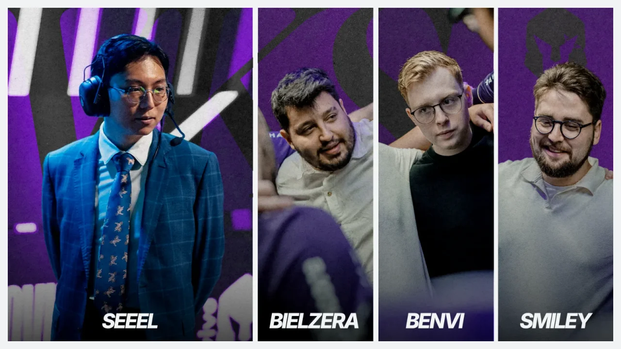
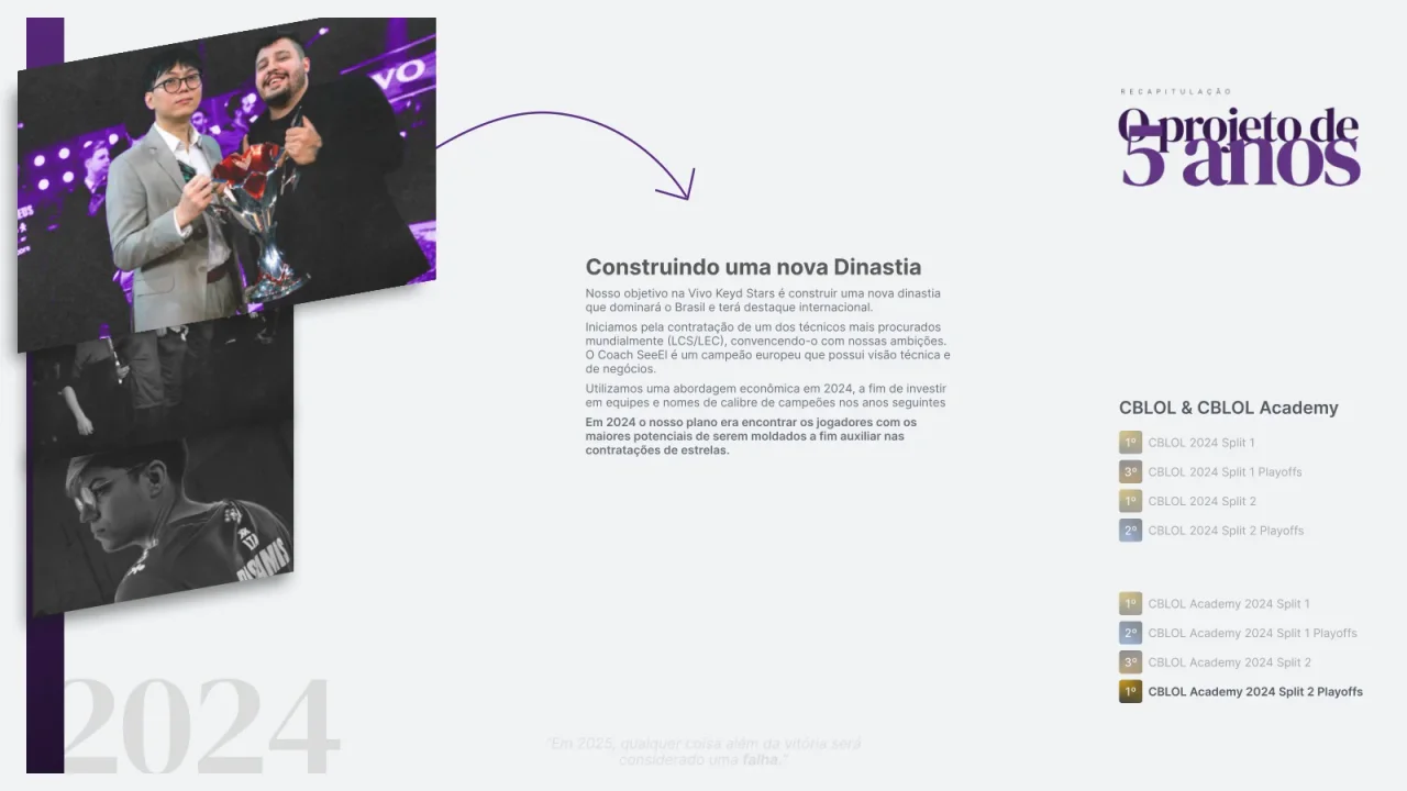
Inside the sections, a small system keeps thirty-five slides consistent. A serif and a condensed italic sans handle the type. Oversized numerals act as structure and image masks, a diagonal band carries quotes, and every photo is cut out and graded to the same purple. Each player section repeats the pattern (number, portrait, label), so the deck reads as one piece even though every slide is composed individually.


04 / Other decks
Structure first, then style.
The other decks were more text-led and needed clarity more than drama.
Projeto Keyd 2025 (Nov 2024).
The first VKS deck presented the team's plans for the 2025 season: a light and a purple layout family, consistent headers, and roster cards with each player's history.
Savicore presentation and investor decks.
Dark, restrained layouts close to the product, with serif headlines and a single red accent. I turned product designs into slides that explain features to non-designers.
Savicore + ExitLag partnership proposal.
A commercial deck structuring the partnership into clear offers, such as ambassador, discount program, and product placement, each with its own repeatable slide layout.
05 / Community graphics
Templates for every tournament.
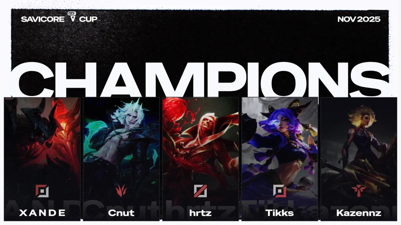
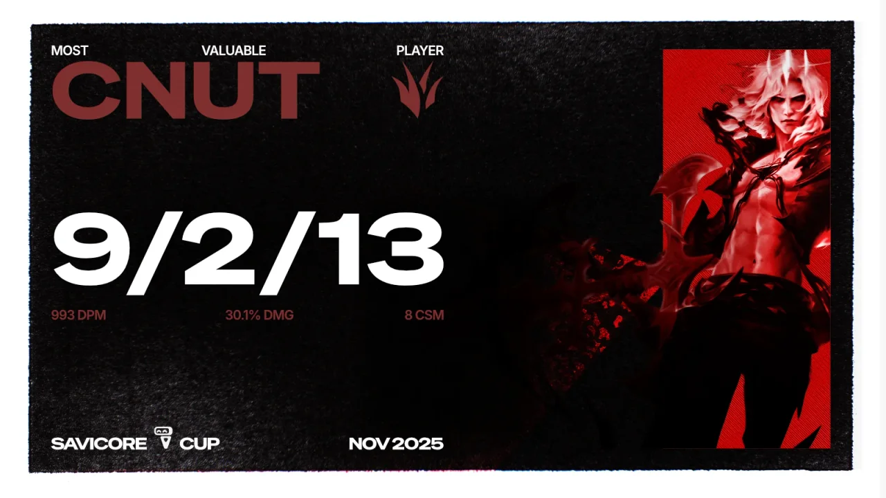
For Savicore's community tournaments, I designed champions and MVP posts for social media as templates, so each new edition only needs names, champions, and stats swapped in.
06 / Reflection
Systems work outside the product too.
The habit that shapes my product work shaped these decks: define a small set of rules (type, colour, a repeatable layout), then let each piece vary within them. That's what made fast-turnaround requests possible without the work looking rushed.
Next case study
Insurance app concept All work